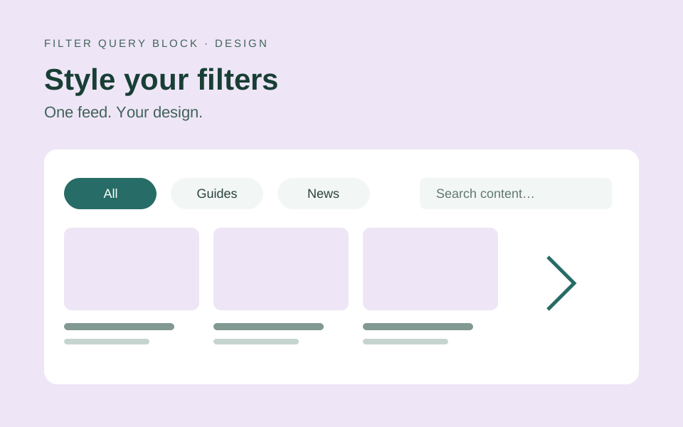
Use the defaults as your starting point
A filter row should make the content easier to explore. It should not take more attention than the results. Version 4 starts with readable text, modest desktop padding and larger phone targets, so a new filter can work well before you adjust individual controls.
Insert a Filter Query and choose a ready-to-use design. The design includes the filter layout and native result blocks. You can change either later: the filter bar controls the controls, while the core Post Template controls the cards or rows.
Pick one shared visual language
Select the filter bar, open Edit Filter Query and choose Filters. Start with the shared theme. Outlined works when the row needs clear boundaries; Soft gives controls a quieter surface; Filled gives the selected options more visual weight. Unstyled lets the site theme provide more of the appearance.
Then choose a shape. Pills suit short horizontal topic buttons, rounded corners work well for fields and dropdowns, and square controls can fit a more structured layout. Use Control size → Compact if the desktop row needs a slimmer profile. Phone controls keep usable touch targets.
Keep one shared theme across the row before adding exceptions. Shared typography, color, border and spacing settings help category buttons, search and reset look like parts of the same interface.
Customize an individual control only when needed
Open Controls and select a control to adjust its label, presentation and styles. A category filter with five topics might use Buttons; a taxonomy with dozens of terms is often easier to browse in a dropdown. These are presentation decisions rather than changes to the result-card design.
For buttons, the selection indicator and selected-label underline can each be enabled separately. Both default to off. If you add decoration, check the selected, unselected, hover and keyboard focus states together so visitors can distinguish them.
Individual style overrides take priority over shared styling. For example, a search field can have its own corner radius while other controls keep the filter bar’s shape. Avoid adding a separate font size or padding to every control unless the design really requires it.
Restore the defaults safely
In Filters, open Style defaults and choose Reset style customizations to clear shared and owned control style overrides. The reset keeps the selected theme and shape, labels, sources, choices, rules, custom classes and the surrounding result layout.
In an individual control, the same action clears that control’s style overrides so it inherits from the filter bar again. It does not replace the control or remove its content configuration.
The reset remains a draft inside the settings modal until you choose Apply changes. Discard or cancel if you prefer the previous styling. After applying, WordPress Undo is available during the editing session. Save the page only when the preview looks right.
Review the whole row at realistic sizes
Check a wide desktop view, a narrower tablet and a phone. Long category labels, a large More menu and a search field can change how the row wraps. Use the phone dialog where it helps reduce clutter, and make sure every choice remains available.
Use keyboard Tab to reach each control and confirm the focus outline is visible. Check readable contrast, zoom and the no-results message. A slim desktop row still needs clear interaction states and comfortable phone targets.
For a practical starting point, follow the category filter tutorial. Browse the live design demos before choosing the layout for your site.